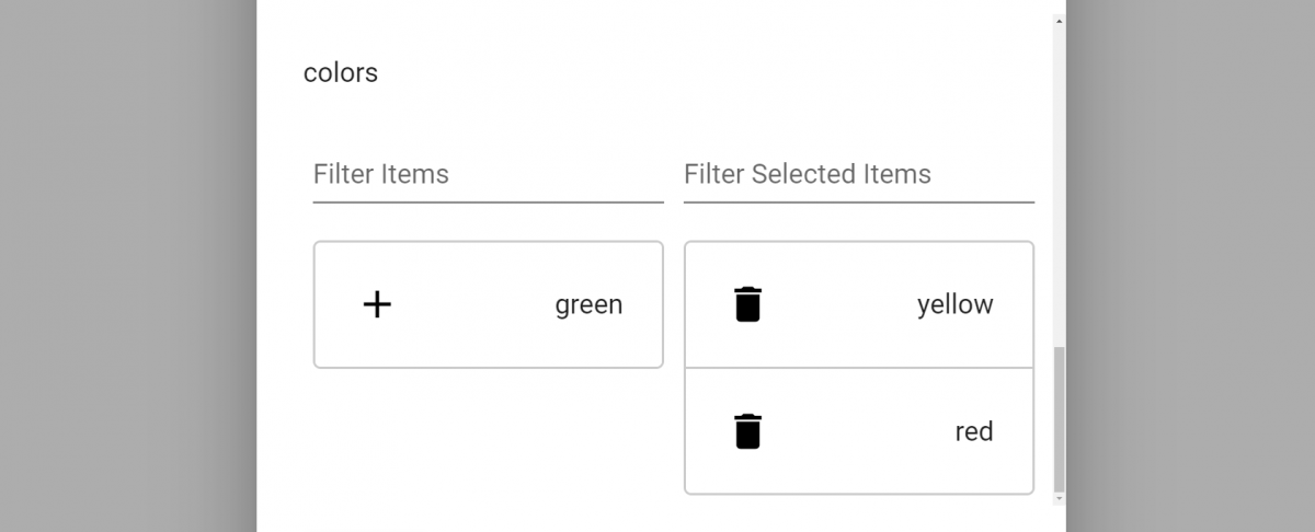
Simple dual listbox component to use with your Angular 10 App with Angular Material
I found really strange that I’m the only one that needed a dual listbox, and on a simple google search I only found those two: Angular Dual-Listbox by czeckd and NgxMaterialDualListbox by blandialcani and both are great 😁 even if blandicani’s one isn’t updated.
As part of my Basic Angular 10 Crud Generator, Powered by Python EVE I needed a Dual Listbox, so why not share with you.
Source Code:
Dependencies
You will need:
- Angular 10
- Angular Material ^10
- For drag and drop version: Angular cdk ^10
Instalation of Material Dual Listbox
To install this library, run:
Without drag and drop:
$ npm install mea-material-dual-listbox --save

With drag and drop:
$ npm install material-dual-listbox --save
and then from your Angular AppModule:
import { BrowserModule } from '@angular/platform-browser';
import { NgModule } from '@angular/core';

import { AppComponent } from './app.component';

// Import the module without drag and drop:
import { MaterialDualListboxModule } from 'mea-material-dual-listbox';

// Import the module with drag and drop:
import { MaterialDualListboxModule } from 'material-dual-listbox';

@NgModule({
  declarations: [
    AppComponent
  ],
  imports: [
    BrowserModule,

    // Add the module in the impots
    MaterialDualListboxModule
  ],
  providers: [],
  bootstrap: [AppComponent]
})
export class AppModule { }
Once the library is imported, you can use the component in your Angular application:
<material-dual-listbox [source]="items" [(destination)]="'itemsDestination'">
</material-dual-listbox>
Attributes
- source – The source array of objects
- destination – The destination array of objects
- (destinationChange) – An event triggered when the destination array changes.
- display – The field of each object in the source and destination arrays, default is
name. - width – The width of the component, default is
360px - filter – A boolean whether or not to display a filter for the lists, default is
true. - searchPlaceholder – filter placeholder, default is
Filter - header – A boolean whether or not to display a header for the lists, default is
false - itemsTitle – The title of the source array, default is
Items - itemsSelectedTitle – The title of the destination array, default is
Selected Items - showIcons – A boolean wheter or not to display icons for the lists, default is
true - addIcon – The material icon for the source array, default is
add - removeIcon – The material icon for the destination array, default is
delete - addIconColor – The color for the material icon of the source array, default is
black - removeIconColor – The color for the material icon of the destination array, default is
black


Leave a Reply